
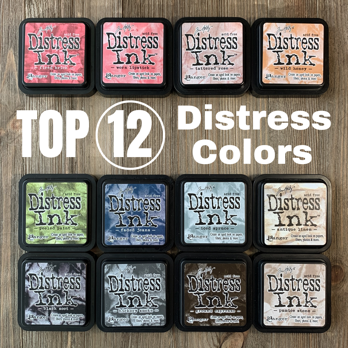
Top 12 Distress Ink Colors
Since the announcement that there will be new colors coming to the Tim Holtz Distress ink line at Ranger Ink, I’ve been thinking a lot about the Distress Ink color palette. And more specifically, it got me thinking about what colors were the most necessary - and used - in the line.
Disclaimer: Some of the links in this article are affiliate links that pay this site a commission at no cost to the user when a purchase is made after a click.
Of course, everyone has different favorite colors depending on their creative style. But to find out what the top colors are that I personally use of Distress ink, I did a survey of my projects.
(These color selections only apply to the original Distress Ink. I’m still working on collecting the Distress Oxide, so it’s hard to tell what I might eventually find is my most favorite of those!)
If I had to live - create - with only 12 Distress ink pads, what would they be? Here are the answers to that question, in something resembling color order:
Black Soot
Black is the ultimate basic, and so of course Black Soot is one of the most-used of my original Tim Holtz Distress Inks. There are several reasons that I reach for this ink over other black inks that I own. First, I love its matte finish that makes stamped images look as though they are an original part of an item instead of a new addition. This ink also handles detail in an image very well, and can be embossed if I want to highlight it or do a resist technique. All in all, my Black Soot Distress ink is a real workhorse for me.
Hickory Smoke
Until Tim announced Hickory Smoke as the Color of the Month for June 2015, one of my biggest complaints about the Distress palette was that there was no true gray. Gray is one of my go-to colors for those times when I want a dark neutral but black is just too harsh, so I was really feeling the lack of it. Whether for creating faux drop shadow edges, stamping vintage images, or creating perfect text elements, Hickory Smoke is definitely one of my can’t-live-without colors!
Ground Espresso
Brown is an essential neutral in a palette. Ground Espresso Distress is the perfect replacement for black when I need something that will complement creamy or earth toned elements. It’s dark enough to carry weight (and to stamp over colored backgrounds), but not so dark that it doesn’t read as a color.
Pumice Stone
This was one of the Distress colors that I’ll admit that I bought really just to complete my set - and then found myself using much more frequently than I could ever have anticipated! Pumice Stone is the cooler of the two light brown Distress inks that I regularly turn to for distressing edges and creating faux drop shadows on elements and just generally grunging things up. It is light enough that it shifts and blends into the background when put on medium to dark colors. It’s also a great color for creating faux antique look paper items using stamps.
Antique Linen
I knew I used this a lot, but I was still somewhat shocked when my supply list tally from the past 5 years rated Antique Linen as my most frequently used Distress ink pad (even beating out Black Soot). This is one of the few Distress ink pads that I’ve had to re-ink due to heavy use. I use Antique Linen ink pad as the warmer partner to Pumice Stone, for inking edges and distressing items, as well as for creating watermark type impressions. Because it is lighter, Antique Linen has even more tendency than Pumice Stone to disappear and take on the tone of a darker shade that it is layered over.
Iced Spruce
This is a color that has grown on me over time, and I was somewhat surprised to find it in the top of my usage tally. Depending on how it is used, Iced Spruce can shift towards blue, green or gray tones, making it a versatile option in my Distress palette for creating vintage looks for all sorts of occasions. Since it is perhaps the closest in the existing palette to the new Speckled Egg Distress color, it will be interesting to see if I use it less after I have the new color in my Distress ink drawer.
Faded Jeans
Like its namesake jeans, this deep blue color is a fabulous neutral that just goes with everything! Faded Jeans Distress ink makes a great replacement for black when I want something that is more friendly and not quite so stark. It can be serious without being cold. This trendy color lends a modern look to any design, yet doesn’t look out of place in a vintage piece either.
Peeled Paint
Green in general is not one of my most frequently used colors but this quirky shade wormed its way into my palette. Peeled Paint is a warm, retro shade of green. At first I was a bit off-put by the 70’s vibe it gave me, but this truly is a versatile color that is good for florals, holidays and other uses. No one green can do everything…but this one can get you pretty far.
Wild Honey
Maybe my 70’s roots are showing because yet another of my most frequently used colors - Wild Honey - evokes memories of rust couches and paisley curtains. But its retro echoes aside, its also a solid color for adding age to some of the colors that are currently trendy in the color palette (like mustard) and also for adding a vintage touch to fall and Halloween.
Tattered Rose
One of the very first Distress ink pads that I bought was Tattered Rose, because - pink! (At the time of course the brighter pinks like Picked Raspberry didn’t exist yet.) This color has seen many uses over the years, from vintage little girl layouts to card making. And I recently discovered a new use for it - it’s the perfect complement color to use for inking edges of trendy peach blush colored items!
Worn Lipstick
This Distress ink shade is the perfect complement to the peony shade of pink that is trendy right now. I use Worn Lipstick a lot for things like inking edges and stamping card sentiments, and of course it makes great hearts and flowers. It’s also versatile to use for a variety of holidays throughout the year.
Fired Brick
There are a lot of great reds in the Distress ink palette, but the rich tones of Fired Brick make it my favorite. This color is bright enough to do a traditional style Christmas palette with, but but not so bright that it loses its ability to create a vintage feeling. I highly recommend this as a first red for a Distress tool box.
Using just these 12 colors, it’s possible to create color schemes for almost any occasion:
Valentine’s Day: Worn Lipstick or Fired Brick or Tattered Rose
Easter: Tattered Rose & Iced Spruce or Worn Lipstick & Peeled Paint
Patriotic: Fired Brick & Faded Jeans
Fall/Halloween/Thanksgiving: Ground Espresso & Wild Honey
Christmas: Tattered Rose & Iced Spruce (retro) or Fired Brick & Peeled Paint
Baby: Iced Spruce or Tattered Rose or Wild Honey
Wedding: Tattered Rose or Iced Spruce or Hickory Smoke
Graduation: Black Soot
Of course, all of these selections were made before the introduction of the upcoming new colors. Will any of the new colors of Distress Ink supplant my old loves in the Top 12 Distress Inks list? Only time will tell!
Do you agree or disagree with my choices? What are your favorite Distress ink colors? Tell me in the comments!