
Scrapbooking Spring with Simple Vintage
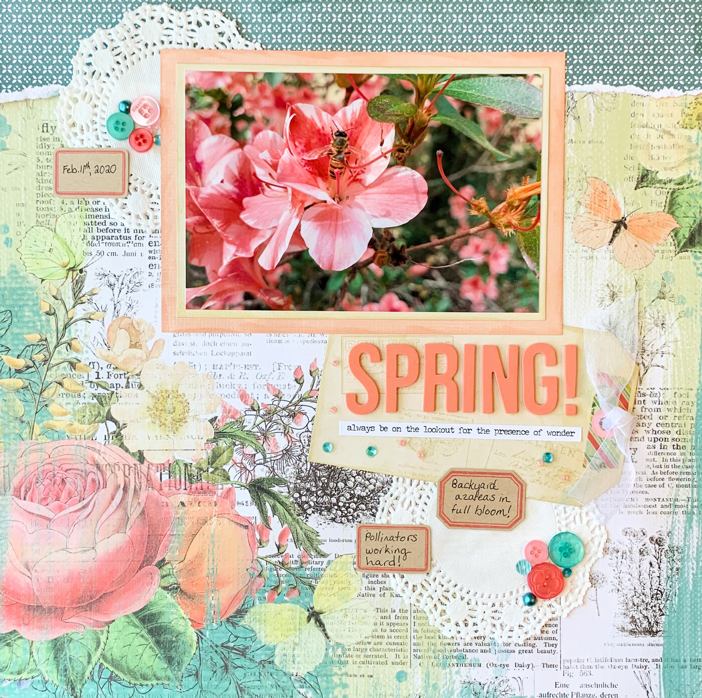
Today I’m scrapbooking spring with a layout that celebrates some of spring’s most important heralds for us in north Florida: blooming azaleas and bees at work!
We’ve been making a big push outside in our garden lately to make it pollinator-friendly. So when I managed to get this close-up photo of a happy bee at work in the azalea plants we’ve been nursing back from years of neglect, I just knew that I had to scrapbook it!
Disclosure: This site participates in the Amazon.com affiliate program. Some links on this site are affiliate links that pay this site a commission at no cost to the reader when a purchase is made after a click.
Supplies Used:
Simple Stories Simple Vintage Garden District paper - Live For Today (Scrapbook.com)
Simple Stories Simple Vintage Garden District paper - 2x2 Elements (Scrapbook.com)
Simple Stories Simple Vintage Garden District 12x12 Basics Kit (Scrapbook.com)
Simple Stories Color Vibe Alphabet Stickers - Coral (Scrapbook.com)
Bazzill Smooth Cardstock - Kraft
Wilton 4” doilies (Amazon.com)
Ranger Tim Holtz Distress Ink - Tattered Rose (Scrapbook.com, A Cherry on Top, Amazon.com)
Ranger Tim Holtz Distress Ink - Iced Spruce (Scrapbook.com, A Cherry on Top, Amazon.com)
Ranger Tim Holtz Distress Ink - Old Paper (Scrapbook.com, A Cherry on Top, Amazon.com)
Ranger Tim Holtz Distress Ink - Worn Lipstick (Scrapbook.com, A Cherry on Top, Amazon.com)
Ranger Tim Holtz Mini Ink Blending Tool (Scrapbook.com, A Cherry on Top, Amazon.com)
Tim Holtz for Stamper’s Anonymous stamps - Field Notes (Scrapbook.com, Amazon.com)
Simple Stories Simple Vintage Botanicals Washi Tape
28 Lilac Lane embellishment bottle - Coral Reef (Scrapbook.com)
Tim Holtz idea-ology stickers - Small Talk (Scrapbook.com, A Cherry on Top, Amazon.com)
7/8” white ribbon
EK Tools 1/2” circle punch (Amazon.com)
5/16” hole punch (Amazon.com)
Glue Dots Craft (Scrapbook.com, A Cherry on Top, Amazon.com)
PPA Matte adhesive (A Cherry on Top, Amazon.com)
Tombow Mono Drawing 01 pen (Amazon.com)
pencil & eraser
Lettermate template (Amazon.com)

I started my layout with this absolutely gorgeous patterned paper from Katie Pertiet’s new Simple Vintage Garden District collection for Simple Stories. Nobody does vintage style botanicals like Katie does! And because there was no way I was covering up those beautiful flower designs, choosing where to position my photo was easy.
To mat my photo so it wouldn’t just blend in the busy background, I used papers from the Simple Vintage Garden District 12x12 Basics Kit to create a double mat. I loved how using wide coral mat set the photo off from the background, but the photo didn’t look right against it. Putting the slim cream border around the photo brightened the image, and kept the coral mat from giving the photo a color cast. I rarely fuss with using a double mat but this time I needed both layers to make my photo look right. (This is why I always check how a mat will look before cutting paper!)
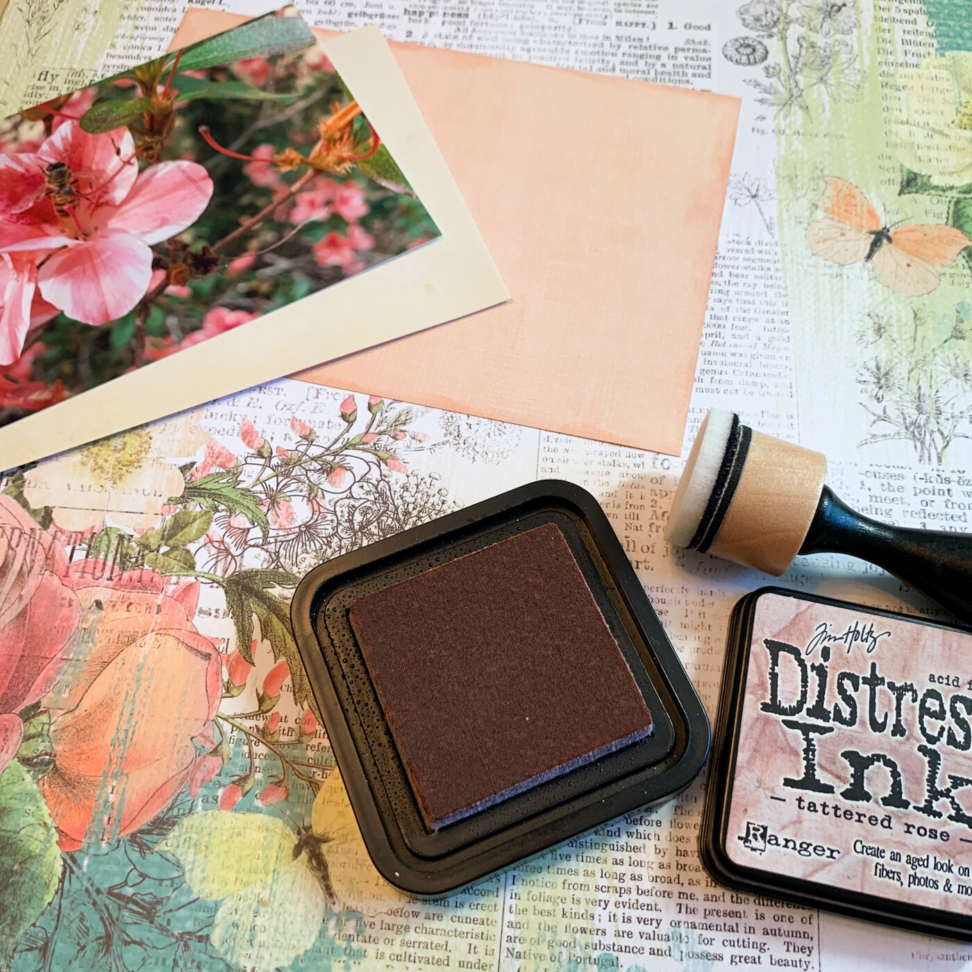
Before assembling the mat I inked the edges of the papers with Old Paper (on the cream) and Tattered Rose (on the coral) to give the edges some depth.

The same cream paper that I used to make the bright edge on the photo mat I also turned into a matching tag. I used my paper trimmer to cut a rectangle the size I wanted and snipped the two corners. A few botanical images from Tim Holtz’s new Field Notes set stamped in Old Paper Distress Ink created a tone on tone design. Then I grabbed a strip of washi tape from last year’s floral Simple Vintage collection, which coordinates beautifully, to use for reinforcing the hole area.
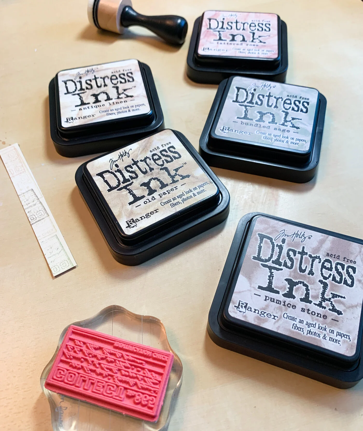
If you’re wondering how I knew to use a pink ink to edge the coral paper, or which brown to use for the tag images…there’s no magic involved. Only trial and error! This is why I keep even the smallest scrap or tear strip when I’m working on a project - they make great test pieces for sampling how inks will look on a specific paper. You can see on the strip in the photo above that I sampled about a half-dozen Distress colors before settling on the Old Paper for stamping the tag.

I use my Tim Holtz ruler for almost everything, and one of my favorite uses for it is getting letter stickers on straight! I’m really obsessive about getting things aligned right, and foam alphabet stickers like this have “give” that makes it extra challenging. Using the edge of the ruler helps get them straight enough that I’m not wincing at how crooked they are every time I see my layout!
Although I was putting my tag on at an angle, I put the text for my spring title lined up straight across. It kept it in alignment with the photo mat, and I think angling it would have made it look like it was falling off the edge.

The next layer was a few embellishments! Because I hadn’t stuck down my previous layers yet, I was able to slide these doilies underneath them. And I finished off my tag with a little hole reinforcer that was custom made using two hole punches.
The biggest addition, though, was the section of patterned paper added to the top edge. It gives the photo something to be anchored to, instead of seeming to be floating.

I wanted to tear the edge to enhance the vintage feel but I also wanted the edge to lay in just a certain place. The solution was to draw (and really soak) a line with a wet cosmetic applicator. I waited a moment…and then was able to tear a perfect line right where I wanted it.
(I can’t remember who taught me this tearing trick, but it has been a lifesaver many times because I am hopeless at dry tearing paper!)

A phrase sticker filled some of the white space that was left on the tag. I wanted to add some journaling so I used the little label stamps from the Field Notes stamp sets to stamp on kraft paper. These were the perfect size since I didn’t need to write paragraph length.
(And now we’ll pause for a moment while all of you who live north of Florida mumble a few spirited things about my spring layout being dated February….)

To finish off my layout, I wanted to add some sparkle and bling! So I grabbed my 28 Lilac Lane “Coral Reef” embellishment bottle. The color scheme looks like it was made to go with this collection! A few clusters of buttons, pearls, and sequns were the perfect final touch for scrapbooking a spring layout.
I still have tons more garden photos to use for scrapbooking spring…and I can’t wait to use more of this Simple Stories Simple Vintage Garden District collection with them!