
What is the difference between original Distress Ink and Distress Oxide?
Tim Holtz recently announced that twelve new colors are being added to his new Distress Oxide ink line, bringing to a total of 24 the colors available in that line. But this new announcement of expansion in the Distress Oxide color palette may have some of our readers who haven't tried the inks yet asking "what is the difference between the original Distress ink and new Distress Oxide ink?"
Let's take a look!
[Disclosure: This site is a participant in the Amazon.com affiliate program. Some links in this article are affiliate links that pay this site a commission when a purchase is made after a click.]
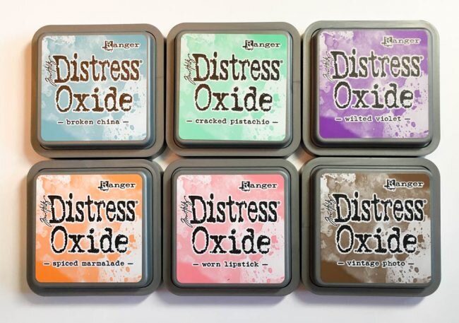
Distress Oxide ink pads
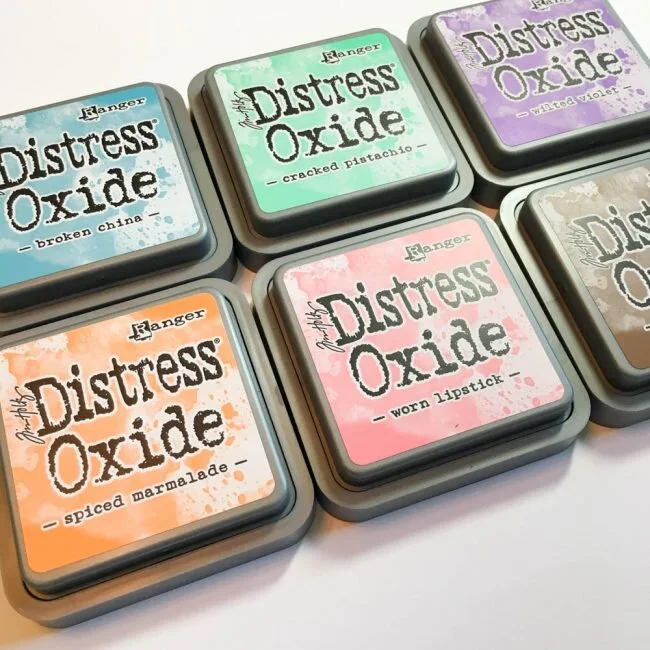
To run my comparison, I used the six Ranger Distress Oxide inks that I have purchased, along with their matching inks from my collection of original Ranger Distress Inks (some of which were provided to me by Ranger at the time of their release).
As an initial comparison, I stamped the inks side by side on plain white cardstock. I specifically chose these Tim Holtz silhouette stamps because their large solid stamping areas are the type of design that make it challenging to get a perfect impression. Plus they give a really good look at the color tones of each ink.
The male silhouette in each pair below is stamped in original Distress ink, and the female profile is stamped in Distress Oxide ink.
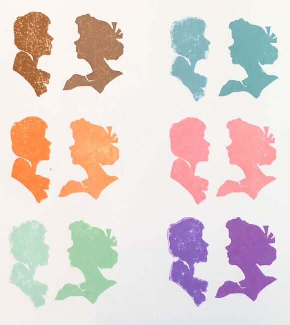
Distress Ink vs Distress Oxide stamping
At first glance, most of the pairs don't seem that different. The color tones on most are fairly close to each other. However, one thing is evident after closer examination (and has been seen in my other use of the ink). The new Distress Oxide image is cleaner, with fewer light spots, than the original Distress Ink in most of the images. Because the Oxide ink is juicier, it is more forgiving in creating a good quality image with a challenging stamp design and on a less than optimal surface.
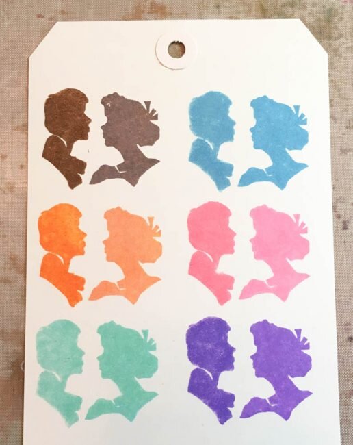
Distress Ink vs Distress Oxide stamping
Moving to stamping on manila tags, a better surface for the inks, and the difference in quality is somewhat less obvious between the two inks, but still slightly noticeable.
One of the key features that is being promoted for Distress Oxide is that it "oxidizes" when exposed to water. But what, exactly, is oxidation? According to Wikipedia, oxidation is "the loss of electrons or an increase in oxidation state by a molecule, atom, or ion." Say what? What does that mean in craft terms?
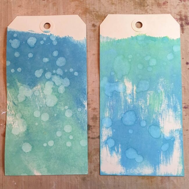
Distress Oxide vs Distress Ink
Distress Ink (left) and Distress Oxide (right)
Above, these two tags have been dragged through ink that was rubbed on my craft sheet, and then had water dripped on them. Both tags end up with light looking spots where the drips were. But if you look closely at the spots, there is a key difference. When water was dripped on the tag with the original Distress Ink, the spots "bleached" and got light. It's almost as if all color has been removed from those spots. In comparison, on the Distress Oxide tag, the spots still have plenty of saturated color in them even though they appear lighter from the water. That is what oxidation looks like in Distress Oxide ink!

Distress vs Distress Oxide test
original Distress ink (left) vs Distress Oxide (right)
Another major difference - translucency - becomes obvious between the two inks when I tried doing a direct-to-paper technique on a dark colored background on these animal cards cut from some idea-ology paper. You can see above how much more opaque the Distress Oxide inks are on the bear and the kangaroo cards than their counterparts in original Distress Ink on the pig and elephant cards. The difference is especially obvious on the Cracked Pistachio inked cards. On the elephant card, the original Distress ink is almost completely transparent, just tinting the card but not impacting the visibility of the image. This is a huge contrast to the Distress Oxide of the same color on the kangaroo card, which completely obliterates the image!

Distress vs Distress Oxide comparison
The more that you handle and manipulate these inks, the more subtle differences that you notice. For this test above, I rubbed the ink pads on my craft sheet, spritzed the sheet with water, and then dragged the tags through the ink. Both tags resulted in a marbled look with this technique. But if you look closely, you'll see on the right above that the Distress Oxide ink pooled and flowed more, whereas the original Distress maintained more structure. You can even see striations in the tag on the left from where it was dragged, whereas the other tag is more shapeless in design.

Distress Ink layered tag
Distress Ink layered tag
Another of the things you will notice is how differently these inks layer. One of the big advantages being touted by Tim Holtz in his Distress Oxide demos since the product's introduction has been that the product can be layered without getting muddy, and you can see in these examples I created how that works.
Above, I created a tag with five different original Distress Inks that were applied in three different layers, by swiping on the craft sheet, spritzing with water and then dragging the tag through. You can see that by the last layer, at least part of the tag had turned to muddy brown.
Contrast that to the tag below, created with the same five colors of ink but in Distress Oxide, and using the same technique. Although original Distress got muddy at three layers, this tag is still showing vibrant color after five layers of inking with Distress Oxide.

Disress Oxide layered tag 2
Some of the differences are subtle, and some not so subtle. But they add up to Distress Oxide being an ink that is an excellent complement to original Distress ink. Used together, the two inks give paper crafters and mixed media artists the ability for almost granular control over the properties of the ink at each stage of their project. Do I want my purple to blend or pool? Do I want my green to be transparent or opaque? Do I need my colors to layer, or not? You can decide the look, and select the appropriate ink - while staying inside the Distress palette.
Distress Oxide ink pads
Ranger Tim Holtz Distress Oxide ink pads have an MSRP of $5.99. Twelve colors were released in Winter 2017, and an additional twelve colors have just been announced and are currently shipping to stores. Distress Oxide is available at Scrapbook.com, Amazon.com, and other crafts retailers.