
Pantone Forecasts the Hot Colors of Fall 2011
Pantone released its Fall 2011 color forecast in mid-February during New York Fashion Week.
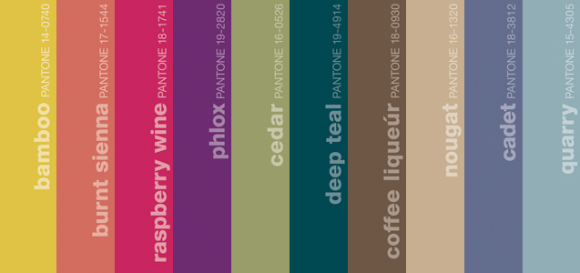
Honeysuckle, Pantone's 2011 color of the year, is still the major player in this palette, but unlike the near-pastel hues of the Spring color forecast we now see it matched with deeper tones that add more contrast to the overall palette. Neutrals in this collection shift noticeably away from the grays of 2010 toward rich browns.

Pantone has also released a separate men's forecast containing more masculine counterparts for many of the colors in the main report.
Pantone attributes the shift to a more classic neutral to consumer's desire to add "stability" to their wardrobe, while the addition of more dramatic colors indicates a need to put a fresh, unexpected twist on old staples.
Many of the new paper lines introduced at CHA Winter 2011 are already showing a trend toward deeper, more vibrant colors. Examples of this trend can be seen in Prima's "Melody," "Moulin Rouge," and "Reflections" lines as well as the new "Stella and Rose" release from My Mind's Eye.
Turquoise, 2010's color of the year, is still a strong theme through many lines, though the tone is often noticeably richer than in 2010 as evidenced by the inclusion of Deep Teal in Pantone's forecast. The previously mentioned "Reflections" and "Stella and Rose" lines are excellent examples of this shift, along with Cosmo Cricket's new "Social Club" and "Salt Air" releases.
The presence of brown as a strong neutral is nothing new to the scrapbooking industry, but its recent resurgence has taken a bit of a departure from the dark tones consumers have seen in the past. Kraft, a close relative of Pantone's Nougat, is an extremely popular neutral among scrapbookers. Tim Holtz has captured the versatility and appeal of this color in his "Kraft Resist" line that was introduced at CHA Winter 2011. Additionally, all three of Crate Paper's new releases- "Toy Box," "Emma's Shoppe," and "Portrait"- rely heavily on warm brown wood-grains as neutrals.
Several other lines released at CHA Winter also sport examples of the new color palette:
- "Countryside" by Studio Calico
- "Upcycle" by Cosmo Cricket
- "Ladies and Gents" by Webster's Pages
- "Trendsetter" by Webster's Pages
- "Sew Cute" by My Little Shoebox
- "Oasis" by My Little Shoebox
- "Happily Lost" by Lily Bee Design
- "This and That" by Lily Bee Design
- "Ellie's Tale" by Sassafras
- "Sweet Threads" by BasicGrey
- "Hello Luscious" by BasicGrey
If the current trend holds, CHA Summer 2011 could bring Halloween and Christmas lines in jewel-tones, with the possibility of some very unexpected and non-traditional color schemes.
To read the complete report (also available as a PDF) or to download the Fall 2011 palette for Adobe applications, visit Pantone's web site.