
Layer Ephemera for an Artsy Travel Layout
I love layers! They are the foundation of my creative process. And for this layout, layered ephemera elements were the perfect complement to my photo of a famous work of art!
Disclaimer: This site is a participant in the Amazon.com affiliate program. Links in this article are affiliate links to Amazon.com or Scrapbook.com that pay this site a commission at no cost to the reader when a purchase is made after a click.
When I travel to places like Paris, I always come home with loads of photos of amazing art. But doing justice to an iconic work of art on a scrapbook page can be an intimidating proposition! This photo of Rodin’s “Thinker” statue at the Musee Rodin in Paris was extra challenging because it was a dull gray rainy winter day when I visited the museum. To solve this, I reached for a paper pack that has become a staple for me lately - and my favorite layering technique.

Supplies Used:
white smooth cardstock
American Crafts Thickers - Vicki
DMC six strand embroidery thread - black
black brad

I always like to establish a “base” of sorts to build off of when creating my layers. For this layout, it consisted of the matted photo, a journaling card, and an ephemera card. I chose white for the photo mat because it brightened up the gray photo, and it played off the contrast with the white writing on the background paper. (As it turned out, I ended up covering up almost all of that writing with other elements, but that’s the creative process - you never know where it will take you!)
The blue color in the background paper highlights the blue-green of the statute, and the kraft colored ephemera highlights the stone base and the building. Even though it doesn’t match exactly, the effect is harmonious.

I am terrible at getting alphabet stickers lined up straight, but it drives me crazy if they aren’t just right. Sticking down a strip of washi tape temporarily is a cheat that I started using recently to provide a base to line the stickers up on. When I’m done, I can just carefully peel it up. As long as I don’t stick it down too hard, it comes up without a problem, and my letters are straighter, which makes me happy!
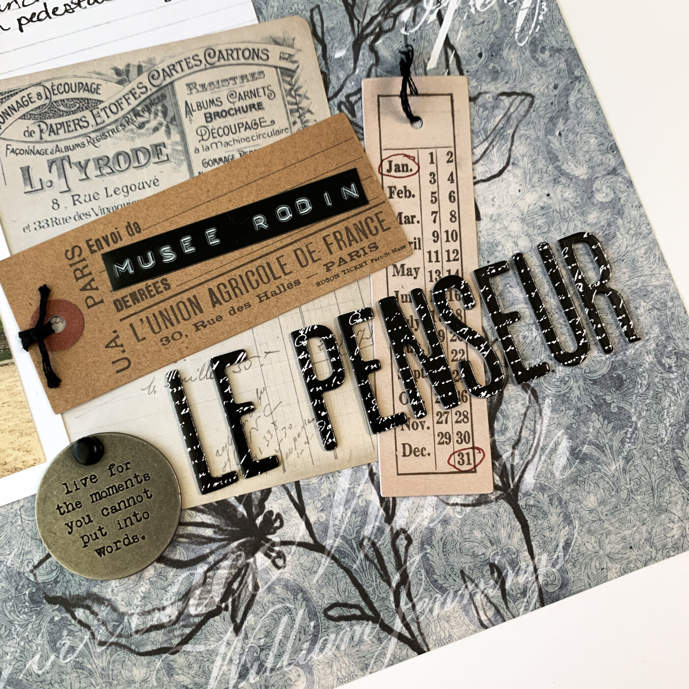
The black title, black label maker tape, black thread, and the black brad all are intended to coordinate with the black design in the background paper. It also ties these elements to the darker areas of the statue, which appear black.

I’m kind of obsessed with using groups or triangles of three on my layouts. The two punched circles (punched from a Tim Holtz journal card) spread around the layout create a visual triangle with the quote tag embellishment. They also spread a bit of the kraft color around the layout. And for the final finishing touch, I added some printable journaling stickers from my Nally Studios store on Etsy that I printed and then cut on my Cricut Maker!

If you like this patterned paper, don’t miss the other layouts I’ve made with this collection: