
Layout | San Francisco Instagram Layout
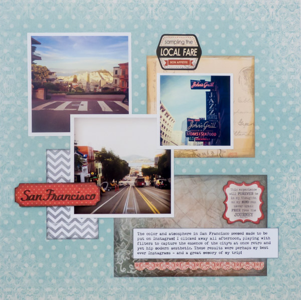
After I finished with my Graphic 45 shadowbox of my San Francisco trip, I had some leftover Instagram prints. These prints, which were printed as Persnickety Prints press prints, were just too beautiful to waste so I decided to make an Instagram layout out of them for my album!
[Disclosure: Some links in this article are affiliate links that pay this site a commission when a purchase is made after a click.]
San Francisco Layout
Supplies:
Quick Quotes "Baggage Claim" Paper kit
Quick Quotes "Baggage Claim" Die Cut Stickers
Quick Quotes "Baggage Claim" Die Cut Stickers
Simple Stories "Color Vibe Lights - Weathered" pattern paper
Cricut Cut File (Label)
Cricut Font (Billionaire)
Bazzill Smooth Cardstock (white)
Remington Noiseless font
American Crafts foam dots
Ranger Tim Holtz Distress Ink (Black Soot, Antique Linen, Pumice Stone, Hickory Smoke)
The combination of red highlights, browns, and blues in the photos made them a perfect match for the Quote Quotes "Baggage Claim" collection that I had bought recently. I wanted to sneak a bit of gray in, along with a bit more graphic vibe to reflect the city's eclectic nature, so I added a sheet of Simple Stories Color Vibe Lights in a nice tone of gray to the mix as well.
My first decision was the arrangement of the photos. Once I had that set, all of the other elements were built in around (and even under) them. Nothing on my pages is fastened down until the design is complete (or almost complete).
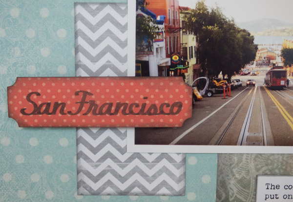
San Francisco title
I didn't want the title to overwhelm the photos. By making it small but in a bright color and raised with foam dots, it is highlighted.
I wish I could take credit for the lovely handwriting on the title piece but it is my Cricut Explore machine! Ever since I stumbled on the new Cricut pen set in Michaels that includes a calligraphy tip pen for the Explore line of machines, I had been looking for a project to try it out on. This label - also die cut on my Explore - was the perfect chance! The new pen worked better than I even dared to hope and I was thrilled with the results! I hope that Cricut comes out with additional colors in them.
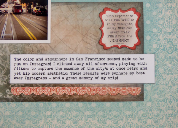
San Francisco journaling
The Instagram prints have a lot of dark vignette filtering on them and it seemed appropriate to extend that to the paper elements on the layout as well. So I got out my Tim Holtz Distress ink pads and went to work.
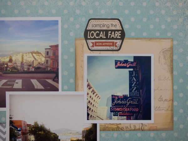
For the gray chevron paper, I got to play with the brand new Hickory Smoke color, which is now officially my favorite Distress color. I've been waiting a long time for a nice silvery gray to join the palette!
The chipboard elements were quick and easy embellishments to add, and extended the pop of red from the title block across the page. The border chipboard piece was just the right size to highlight my journaling block with. I chose a vintage typewriter font for my journaling, to keep with the retro feel of the layout. Plus, I just love typewriter fonts - they go with everything!
San Francisco layout close up
To visually balance the size of the smaller Instagram print in the photo arrangement, I added a patterned paper mat around it. The mat was distressed to create a vignette around the edges. This vignette was layered, created with two different colors (Antique Linen and Pumice Stone) to give it depth and shading.
The sticker at the top of the layout completes a visual triangle between the embellishments on the page (the title and the chipboard by the journaling). But it also highlights that we actually ate at the restaurant in the photo.
This layout happened by accident. I hadn't planned to scrap these photos, but when they were in front of me as a group by chance, suddenly a layout I love came together! Inspiration can sneak up on us at the most unexpected times...do you listen when it whispers in your ear?