
Pantone Announces Twin Colors of the Year for 2016
[Disclosure: Some links in this article are affiliate links that pay this site a commission when a purchase is made after a click.]
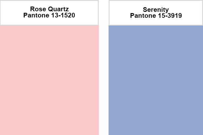
In an unprecedented move, Pantone has announced two colors of the year for 2016: Rose Quartz and Serenity.
Pantone swatches
While to most of us the colors look like the nursery section of a department store, Pantone has other ideas, describing the Colors of the Year in the announcement as following:
Weightless and airy, like the expanse of the blue sky above us, Serenity comforts with a calming effect, bringing feelings of respite and relaxation even in turbulent times. Rose Quartz is a persuasive yet gentle tone that conveys compassion and a sense of composure.
Pantone explained the move to choose two colors as creating balance in its Color of the Year 2016. “With the whole greater than its individual parts, joined together Serenity and Rose Quartz demonstrate an inherent balance between a warmer embracing rose tone and the cooler tranquil blue, reflecting connection and wellness as well as a soothing sense of order and peace,” said Leatrice Eiseman, Executive Director of the Pantone Color Institute.
The pink and blue pastel colors are notable not just for being the first dual colors of the year. Pantone's usual Color of the Year selections lean toward much brighter, more saturated, colors. The last pastel seen as Color of the Year was 2003's Aqua Sky, but even that was arguably more saturated than the 2016 selections. While not technically a pastel, for 2006, Pantone selected a pale neutral beige called Sand Dollar as Color of the Year.
The color codes for the new Pantone Colors of the Year are:
Rose Quartz
sRgb: 247 202 201
CMYK: 0 24 15 0
HTML: F7CAC9
Serenity:
sRGB: 146 168 209
CMYK: 42 24 3 0
HTML: 92A8D1
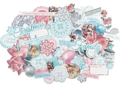
In an interesting preview of the 2016 Colors of the Year, this year's Christmas scrapbook lines were sprinkled with pastel pink and blue. Although, when compared side by side, "Serenity" is much more purple than the prevalent blue tone in most of the holiday lines. Kaisercraft's Silver Bells line is a good comparison:
Kaisercraft Silver Bells
So what do you think of Pantone's decision to do two colors of the year? Good, bad, publicity gimmick? What do you think of the colors?