
Gallery Highlights | 2.14.2013
Welcome to another edition of gallery highlights! This week’s layouts are all about using photo placement to build a solid design. All of these designers used classic, traditional designs but added something unique to each of them that truly make their layouts shine. I love every single one of these layouts and I can’t wait for you to see them. Let’s go take a look and I hope you like them all as much as I do. Don’t forget – you can click on the links to visit the layouts in their galleries and view supply lists, leave a comment for the designer, or view the designer’s other work.
Turning 4 by Kathleen Summers
Kathleen grouped her photos and embellishments in the middle of her page and then worked out towards the edges with stitching and stamping. I really love that a large portion of her collage is a mixed pattern of papers forming a sunburst pattern. It draws more attention to her focal photo and adds a lot of color and energy to the layout. It's a beautiful layout made even better with a fantastic design.

g3
As Time Goes By by cathann
Cath used one of my favorite go-to layout designs on her layout. She placed her photos in a horizontal row across the middle of her layout and stretched them almost to the very edges of the page. She then added a title, journaling and embellishments to the top and bottom. It's a very classic, clean design style and does a gorgeous job of showcasing these photos of her daughter's growth.

g1
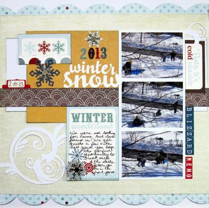
Blizzard Nemo by AllisonLP
In contrast to Cath's layout, Allison placed her photos off-center and in a vertical line on her page. She then added balance to the layout by adding in a piece of brightly-colored cardstock on the left side and added her title, embellishments and journaling over that. I love this design and really like the unexpected pops of color that Allison added to it.
g2
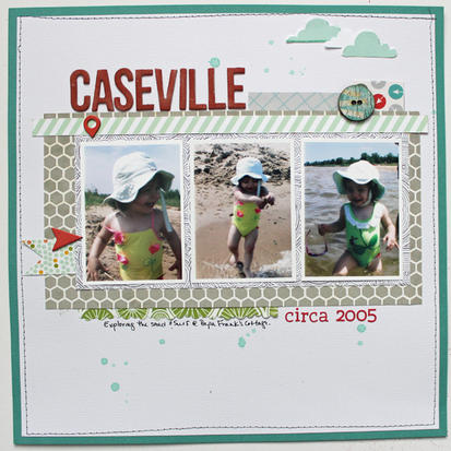
Caseville circa 2005 by marias
Maria placed her photos across the center of the page in a horizontal row but left plenty of space around all 4 sides to add a patterned-paper mat, stitching and embellishments. This is another classic, beautiful layout design and she executed it beautifully. One of my favorite aspects of it, along with the design, are the pops of red she added. They contrast beautifully with the white, grey and teal background.
g5
Tractor Rides by voneall
Valerie's layout is designed on a grid of stitching - one of my absolute favorite design styles. However, she adds a lot of fun and interest to this style by placing her photos asymmetrically within the grid. She also added three different sized photos to the layout - I would never have thought to do that and I love it here! She added papers and journaling to fill up the rest of the grids and the overall effect is stunning.

g4
And there you have them - our gallery highlights! I love all of these and I really do wish we had time and space to feature more of the amazing designs out there. Thanks so much to all of the designers who shared their work with us this week. What were your favorite gallery layouts last week? Feel free to link us to them in the comments and let us know what you think and which are your current favorites in the galleries!
-Stephanie Vetne