
Creativeworld 2018 Trend Show Tour, Part 1: The Purist
Without a doubt, one of the more interesting things that I look forward to seeing each year at the Creativeworld show in Frankfurt is the Trend Show display. (Or, as it is called in the Messe's native German - "trend schau".)
[Disclosure: Messe Frankfurt and the Creativeworld show are a sponsor of this site.]
The Creativeworld trend show is divided each year into three themes that highlight a different trend happening in creative industries. For 2018, the themes selected by the Messe's trend consultants were "the purist", "the colourist", and "the gardener".

Credit: Messe Frankfurt Exhibition GmbH
This article focuses on the first of the trend show's featured concepts, the purist. The trend named "the purist" by the Messe is perhaps best translated into English as "minimalism" - simple, clean, and subtle. That's not to say the purist style is without detail. But what details are present are fine and modest. This is not a style of large exuberant floral patterns, or in-your-face bling. It's restful, and elegant.

Creativeworld 2018 Trend Show Purity
Credit: Messe Frankfurt Exhibition GmbH / Jean-Luc Valentin
The most extreme form of "the purist" in practice is monochromatic white designed with simple details. In the Creativeworld trend show, it was seen in these plaster cast vases and bowls in varying - but simple - styles. In home decor, this is a trend that has been seen in recent years manifesting in all-white bathrooms, with subway tile and marble providing subtle details that still maintain the monochromatic effect. Papercrafters can create this look easily with a simple embossing folder and white cardstock.

Creativeworld Purist Trend Show
Because "the purist" is all about subtle contrast, black and white contrast must be balanced carefully. Here, the black pattern is applied with a delicate touch. The varying sizes of dots and space between them soften the effect of the contrast.

Creativeworld Purist Trend Show 1
Color is welcome in "the purist" palette, but it creeps in softly in gentle hints rather than bold pronouncements. The Pantone Colors of the Year for 2016 - Rose Quartz and Serenity - are excellent examples of this light touch of color. The two colors continue to be popular since their color of the year spotlight (perhaps even more popular than they were initially during their spotlight year).

Creativeworld Purist Trend Show
There's slightly more saturated color in "the purist" palette too...but the tones are muted. These rose-inspired pink and coral pigments are luxurious without being overwhelming to the eye. The result is a subtle elegance rather than brilliant effusiveness.
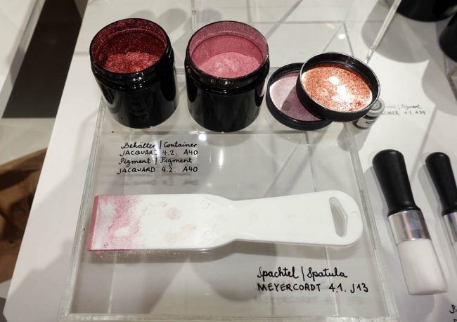
Creativeworld Purist Trend Show
For one of "the purist" trend show displays, the subtle rose and neutral shades of the purist were paired with another trend that Creativeworld called "the next big thing" - knit and crochet. The subtle pattern and color of these items created with soothing soft yarn incorporates the concept of "purist" into every aspect of their design.

Creativeworld 2018 Trend Show Purist Knitting
Come back tomorrow to learn about the second featured trend at the Creativeworld trend show - the Colourist!