
Project | Travel Album: The Römer
The third layout set is complete for my travel album of my trip to Frankfurt in January for Creativeworld!
[Disclosure: This site is a participant in the Amazon.com affiliate program. Some links in this article are affiliate links that pay this site a commission when a purchase is made after a click.]
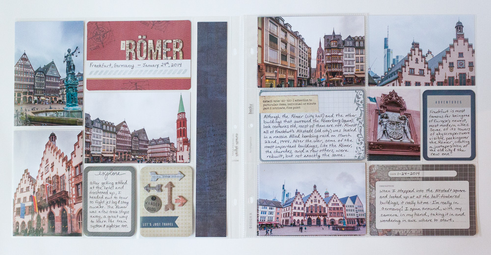
The tone of this layout is different from the two previous ones, because this is the first layout that shows any of the historic sites that I saw on the trip. So the color scheme was darker than the two previous layouts. For this layout, I drew from two Project Life core kits. The major contribution came from the Project Life "Vintage Travel" core kit, which is an exclusive to Michaels Stores. That kit has the same brown shades in it as the Cinnamon core kit, so I was able to snag a few journaling cards from that kit as well to fill out my layout's design.
The title of this layout has a double meaning. The Römer is the name of the historic Frankfurt city hall that sits on the square I visited in these photos, but the English homonym "the roamer" also means "the wanderer" which is exactly what I did that day, hopping on the train and heading off into this area of Frankfurt without an exact plan of where I was going or what I intended to do.
Project Life Romer full

Project Life Romer full 2
Supplies:
Project Life Core Kits (Vintage Travel, Cinnamon)
Project Life Page Protector (Design A)
Tim Holtz idea-ology Paper Stash (Crowded Attic)
American Crafts Thickers Alphabet (Everywhere)
Tim Holtz idea-ology stickers (Chit Chat)
Heidi Swapp stickers (Definition)
Heidi Swapp Color Magic Chipboard (Arrows)
Tim Holtz idea-ology embellishments (Philosophy Tags)
Making Memories embellishments (brads)
Tim Holtz for Stamper's Anonymous stamps (Mini Blueprints 3)
Teresa Collins for Stamper's Anonymous stamp (Utensils)
Ali Edwards for Technique Tuesday stamps (Fun Flair, The Observant Traveler)
Dawn Houser for Inkadinkado stamp (Text Script)
Hero Arts stamp (Graph Background)
Close To My Heart stamp (One Way Borders)
Ranger Tim Holtz Distress Ink Pad (Antique Linen, Pumice Stone, Embossing)
Ranger Wendy Vecchi Archival Ink Pad (Orange Blossom)
Ranger Archival Ink Pad (Jet Black)
Tsukineko Staz-On Ink Pad (Stone Gray)
Tsukineko Brilliance Dewdrop Ink Pads (Cosmic Copper, Lightning Black)
Colorbox Mixed Media Ink Pad (Pewter)
Stampendous Embossing Powder (Detail Silver)
Tim Holtz idea-ology Texture Hammer
Pitt Artist Pen (Black - S)
The design of this layout is simpler than the previous ones. The photos are so busy with the intricate detail of the buildings that a busier layout would have overwhelmed them, and the layout would have just been exhausting to look at. The simpler design put the focus on the photos and the story in the journaling.
Of course, I did sneak in some map pattern on this layout again! The title letters and one of the journaling cards have map pattern on them. That's become my little "easter egg" that I'm trying to make sure is on every layout. We'll see if I can pull it off! I may have to get creative as the album goes on!
One thing that you'll notice looking at this layout's supply list is that, despite the relative simplicity of the overall layout, I relied heavily on stamps and inks to do what I did on it. The design utilized seven stamp sets, and nine ink pads. Stamps and ink seem to be my best investment lately for my toolbox.
Project Life Romer left
Two of those stamp sets were used on the title card. The Tim Holtz Mini Blueprints 3 set created some texture on the rust colored background, and then a stamp from the Close To My Heart One Way Borders was used to fill in some blank space in the journaling area on the card. These stamps and similar ones from the company are mostly thought of by CTMH fans as being for cardmaking, but as you can see on the card above, they are perfect for embellishing pocket cards!

Close To My Heart One Way Borders
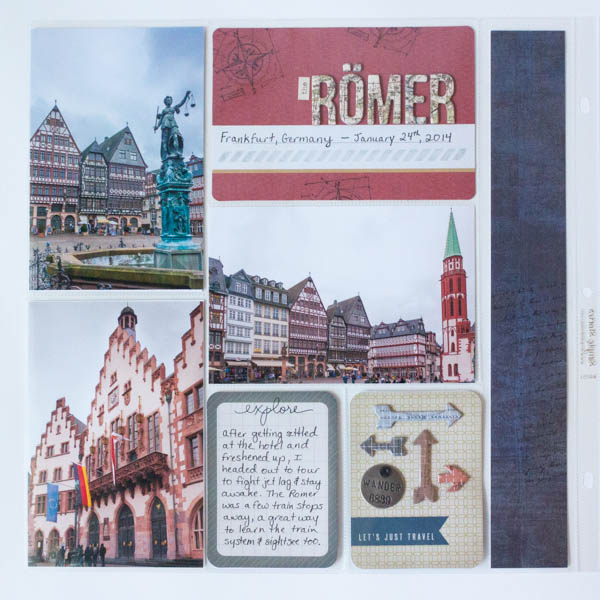
I also stamped on the vertical strip of paper with a script text stamp to add some visual texture to the dark blue paper. Since the item behind it in the pocket had so much bulk already, I didn't want to add another embellishment to this side of the pocket. The stamp gave it a little bit of ooomph without adding bulk.
The two 3x4 cards at the bottom of the page also got some embellishment. The journaling card got a stamped word from one of my favorite travel sets - Ali Edwards' Observant Traveler set (available from Technique Tuesday). The Let's Just Travel Card had a bunch of white space on it that I felt the need to fill, so I inked up some Color Magic Chipboard and added a Tim Holtz metal tag. The colors of the chipboard combine colors out of the Project Life elements and the photos, and tie them together.
Besides stamps, another thing I'm using a lot of it seems for this album are insert pages. I take a lot of pictures, and I want to put a lot of journaling in this album as well, so I need extra pockets! For this layout, I added an American Crafts page protector that displays 3 - 4x6 photos horizontally.
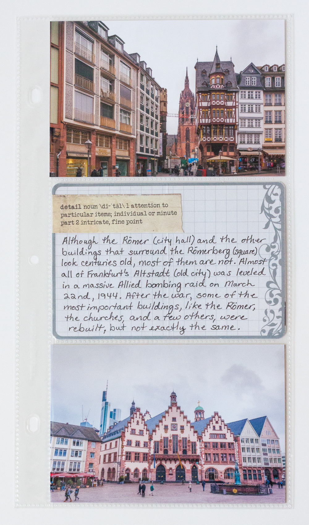
Project Life Romer Insert front
I used a sticker to amp up the vintage style of the journaling card before using the card to record some of the history of the buildings that I saw, which was important to add context to the story.
I probably could have trimmed the bottom photo in the insert to remove some of the bland sky, and then mounted it on a 4x6 piece of paper, but that would have added more busy detail to the page. It's simpler and cleaner with the photo uncropped.
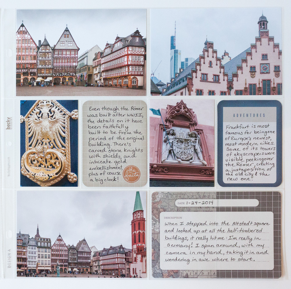
Project Life Romer left
The right page of the layout has more journaling than I am used to putting on my layouts, and no decorative elements other than a single flair stamp on what was an otherwise blank journaling card. The journaling card on the bottom right has the map print in it, to carry my map theme. Other than that, the photos carry the story.
Project Life Romer insert back
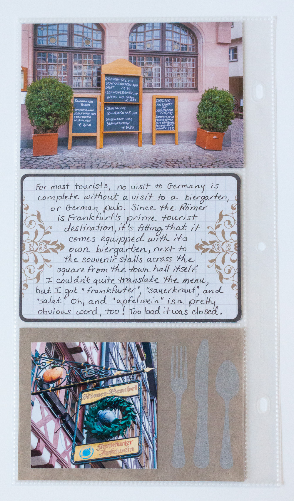
The back of the insert page is devoted to photos of the biergarten that sits on the historic Römerberg square. I was really proud of these photos - they are some of the few here I tried to get artsy with, so I wanted to highlight them. The large journaling card is one of the few that I took from the Cinnamon core kit.
It is barely visible behind the photo of the sign on the bottom, but I used the Hero Arts "Graph Background" stamp to add some more visual texture to the patterned paper. The color I chose gives it a tone on tone effect that is subtle in person that almost disappeared on camera.

Silver Embossing Close Up
I discovered something by accident when playing with the embossing powder to make the embossed silverware stamp (a Teresa Collins design from Stamper's Anonymous). On the silverware graphic stamped on the left, the Detail Embossing Powder was heated properly, resulting in a glossy raised impression. But it was too shiny for what I wanted, too much bling for the style of the layout. I wondered what would happen if I heated it more. The result was the impression on the right. When I overheated it, the gloss cooked off of the powder, leaving a much more matte impression that was subtle but still silver. It was perfect for what I wanted. Sometimes, misusing a product can get you desired results!
Next up will be the photos that I took in the neighborhood surrounding the Römerberg square. I think I took several hundred photos on my excursion that afternoon, so it's definitely going to take several layouts to cover everything I saw, even after I edit them down to the essentials!
To see the previous layouts in this album so far, click below: