
Using Color Palettes to Inspire Your Layouts – Part Three
I'm back today with part three and my final post in my color palette series. In case you missed the last two posts, in part one I showed how color palettes can be inspiration for choosing products for your layouts or projects. In part two, I offered some ideas for not only using the color palette to inspire your projects, but to use the actual photo to inspire design choices.
In this final installment, I wanted to offer some ways that color palettes can help you solve common paper crafting dilemmas.
1. Adding a pop of color
Ever find yourself with a layout or project in progress that needs something, but you aren't sure what? Try adding some flair with a contrasting color.

SparkledHues
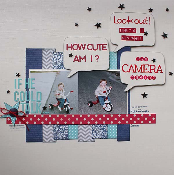
When I saw this color palette it gave me the idea to create a layout in various shade of blue on a neutral background with a pop of red as the accent color.
Here's what I came up with, using this palette for inspiration:
color-layout
Supplies: Vanilla Bazzill cardstock, DCWV Everyday Essentials and Sunshine stacks, Echo Park Navy Chevron/Dot, Pebbles Ash Chevron, Little Yellow Bicycle Saturdays Blue Reverie, American Crafts Dear Lizzy phrase stamp and red jute, alphabet letters from Simple Stories Sn@p, Jillibean Soup and Doodlebug, Studio Calico wood veneer stars and Atmosphere Mister Huey, Jenni Bowlin Weather Vane ink.
I really didn't have a story to go with these photos but as I looked at my nephew's expression, I wondered what his two year old self might have been thinking. I cut the speech bubbles with my Silhouette. In keeping with the idea of a pop of color, I kept the background neutral with shades of blue but added potential thoughts in red letter stickers.
2. A photo with an unusual color
Sometimes you may come across a photo with a funky color and you just can't find the right products to go with it. Maybe the colors clash or maybe there's only one dominant color in the photo and you aren't confident about selecting coordinating colors.
Take this photo for example:

single-color
Off the top of my head, I can't think of any collections I have that include orange and black that aren't Halloween-ish. I could just start digging through all of my pattern paper collections just in case I do have something in my stash. Or, I can turn to my favorite color palette site and see if I can find a palette that will give me more options.
After scrolling through a few pages, I found this palette.

SettingTones_4
This palette includes black and orange and introduces a dusty purple, darker blue and yellow. The coordinating colors give me some direction when searching through my paper collections. I can look for pattern papers that incorporate a few of the colors or I can look for subtle tone-on-tone prints in each color.
If I didn't like that particular palette, I can click on the orange color next to the color palette on the source page and use the "see similar colors" feature. The search will pull up all the color palettes on the site that include that particular color.

CitrusTones505
Here's another palette that that brings organic greens but leaves out the blacks. Might be interesting.

FloralBrights605
Image source
Now this palette goes in a totally different direction bringing in a bright blue that would contrast nicely with the orange.
Options! I love having different options.
3. A scrapbooking product with an unusual color
This same process can work for products too.

color-product
Take this lavender bloomer from Webster's Pages. I've had this in my stash for a few years. I've tried to add this to several layouts in progress, but I've just never been able to make it work. If I ever want to use it, I may need to try a different approach.

FloraBrights
Looking through several pages of color palettes, I came across this one. The lavender is a good match to my embellishment but I'm not crazy about all the pinks and purples -- two colors I don't scrapbook with much. So, I'm going to keep searching and see if I can find something with more contrast.

CandiedHues
Image source
Here's another palette with the same lavender color. I really like this one. It still has a lot of purple, but I love adding in red and turquoise. Using this palette as a starting point, I decided to create a page kit around the embellishment.
Here's what I came up with:

color-kit5
Honestly, I never would have thought to combine these colors together. But with the help of a color palette, I pulled products in other colors that will look great with that lavender bloomer. Seeing all of these products lined up, I can see the potential and I can't wait to put it all to use on a layout.
What photo will I use? I don't know yet. I'll keep these products together in a page protector and the next time I have a new stack of photos to scrapbook I'll see if I can find something that will work. If not, I'll wait until I get the next batch of photos processed or go through my photo archives to see if I can find a past photo that would work. If all else fails, I can always turn some photos to black and white.
4. Using a challenging color
We all have colors that we naturally gravitate to. I love blues and greens and would guess that 75% of my layouts use one or both. But purple is a challenge for me. I do like purple and I have purple supplies in my stash but purple just doesn't show up in my photos that often. How can we incorporate a challenging color more often? Pair it up with colors you are more likely to use.

CornflowerBlues600
Image source
I was instantly drawn to this color palette because of the blues and greens. I have many products in my stash in these colors and I use them all the time. But it hasn't occurred to me to pair them up with purple.
That's how color palettes can be so inspirational. Using this one as a guide, I shopped my stash again:

color-kit4
It didn't take long to round up this group of products. One of the things I love best about creating page kits like this is that it breathes new life into older supplies. I probably would never have selected these products at the same time. But with the inspiration from the color palette, it's almost like they were all designed to go together.
Now that I have some fun new page kits to work with, I need to get busy scrapbooking!
Thank you so much for joining me in this color palette adventure. I hope that I've shared some fun ideas that you can use in your own scrapbooking and paper crafting.
Now go find a fun color palette and let it inspire your next project!
- Tammy Dailor