
Using Color Palettes to Inspire Your Layouts - Part Two
Welcome to part two in my series of articles about using color palettes to help you create scrapbook pages. In part one, we talked about how color palettes can help you make product selections. Today, I wanted to show how color palettes and the accompanying photos to help you make design decisions.
We all come at the design process from different points of view. Many people start with photos and select supplies that match. Others may get the creative juices flowing by opening up a new set of supplies. But what about something entirely different?
I am a big advocate of shaking up the process and approaching a scrapbook layout in a different way. I am a process driven scrapbooker so I understand that it can be easier to just keep doing what works instead of trying something new. But from my own personal experience, I know that approaching the process in a different way can help you stretch your creative muscle.
Today, I wanted to try something a little bit different. I'm going to use color palettes not only to help me make color choices, but I'm also going to use the photo to inspire the design or starting point for some layouts in progress.
Three color palettes, three different layout designs
1. The rule of thirds
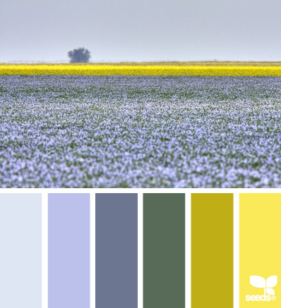
Image source
Image source
This image made me think of the rule of thirds. In the photo above, the bottom two thirds of the photo is in monochromatic shades, while approximately one third down from the top is a splash of contrasting color. I think this composition could result in a dynamic layout design.
Expanding on the idea, I created this layout foundation:

color-palette-design-start2a
While I used the colors for inspiration, they aren't the same. I used pattern papers that I had on hand. I liked the idea of splitting the layout in thirds with a band of green to split the top third from the bottom two thirds. I wanted to change the orientation of the design, so I flipped the foundation 90 degrees to the left. The layout has plenty of white space so I can add two or three photos and there is still plenty of room for journaling and embellishments.
2. A vertical strip
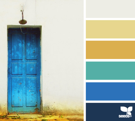
Image source
Image source
This color palette photo made me think of photos going vertically down the page. Maybe it's a photo strip. Maybe it's a few instagram photos. I loved the idea of a vertical strip intersecting with a horizontal band.
Here is the layout foundation I was inspired to create:

color-palette-design-start2b
Here, I used the color palette to choose the pattern papers. I added in several rectangle mats in coordinating colors along with an earthy toned border to ground the mats to the background. There is plenty of white space to the right of the photo strip to add in a long title, journaling and embellishments.
3. Falling off the page

Image source
To inspire the full layout I created, this photo helped me choose where to place the elements in the design. I also took inspiration from the dark background and contrasting white bowl.

color-palette-design
Supplies | Cardstock: Core'dinations Tim Holtz Distress (Chipped Sapphire), Bazzill (White). Patterned Paper: Little Yellow Bicycle "Escape" (Above the Clouds). Embellishment: Jillibean Soup (journaling sprouts), Studio Calico (wood veneer arrows and hearts), Studio 112 sun clip. Stickers: American Crafts (Vera thickers), Simple Stories "SNAP Studio (Typeset stickers). Stamps: Studio Calico (date stamp).
I liked how the bowl of lemons was placed to the right and went out of the frame. I placed my photo in roughly the same place on the edge of the page. I also liked the varying shades of blue in the background. I might not have used a dark blue background, nor a darker blue cloud pattern paper on top of it, had it not worked in color palette photo.
This layout will introduce other layouts from this same day at Legoland, so there wasn't much journaling needed. I included the journaling on white and yellow journaling blocks, further inspired from the color palette and photo. Notice that I used other colors too. My photo contains other colors so I added in more color with the cloud paper and with the sticker words. I started with the color palette, but still let my photo dictate additional choices.
What about the colors in your photos?
I know this question is out there. Traditionally, we take color cues from our photos and try to find matching papers and build from there. Why start with a color palette if it's not going to match the photo?
I have a couple of ideas to think about.
First, there is no hard and fast rule that says your layout colors must perfectly match to your photos.
I'm not saying that if everything clashes, so what. No one would be happy with that. But every once in awhile, it's OK to take a chance and do something you wouldn't normally do. Try to create a layout without the photos in mind. Once you have a layout established, go find photos that work with the colors and mood you've established.
You don't have to change up your process forever, but give it a try and see how it feels. Challenging yourself to approach a page outside your comfort zone can stretch you creatively. Some of my very favorite pages resulted from doing something I wouldn't normally do or scrapbooking a color I don't typically use.
Second, use a palette for inspiration but if it's not 100% perfect, adjust the colors to fit your photo.
Is the yellow not working? Substitute it with the perfect pink shade that does match your photo. Or just use the photo to inspire the layout design and use whatever colors work for you. That is the beauty of inspiration. Take the inspiration as far as you need to, but alter it to suit your photos and your project.
Third, my no fail solution that works every single time is to turn your photos to black and white.
I know that some people cringe at the idea or don't like this because it adds extra steps to your process or is a hassle to get separate photos printed. But it really does work. When you see a palette you want to work with, just for the sheer joy of it (yes, I do believe that we can be filled with joy when working with gorgeous colors), turn your photos to black and white and just enjoy the process!
Next week, we'll look at ways color palettes can help solve a paper crafting dilemma or two.
-Tammy Dailor