
Gallery Highlights | 5.02.2013
It’s Stephanie Vetne here with another edition of gallery highlights! It's been a couple of weeks since my last gallery highlights article and I had so much fun this week looking at all the new layouts. And it looks like everyone's mood is starting to shift towards outside activities and brighter colors! Let’s go take a look at what I found. I hope you like them all as much as I do! Don’t forget – you can click on the links to visit the layouts in their galleries and view supply lists, leave a comment for the designer, or view the designer’s other work.
Spring has Sprung by sophie crespy
Yes, spring has really sprung here in the midwest and I love Sophie's layout! She used a pink background and layered a white sheet of circles over the top. The result is just too cute! I really love how she added photos to some of the circles but not all of them and filled others with embellishments or papers. I am definitely going to scraplift this - it's one of my favorite layouts this year so far!

g4
Ordinary Miracle by Yellowpeep
Liana's layout is just breathtaking, isn't it? It's so simple, yet very creative and she maintained focus on these gorgeous family photos. The typed journaling off to the side is clearly part of the story but her placement and font size still lets the photos take center stage. What a stunning layout!

g3
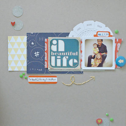
A Beautiful Life by Michelle Wedertz
I love how fun Michelle's layout is! She used a pre-made card for her title and placed that in the center of her collage - a lovely, unique way to move the eye directly to the photo beside it. And putting the round date embellishment behind the photo was the perfect touch!
SONY DSC
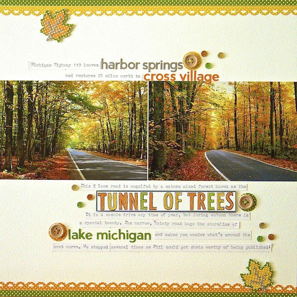
Tunnel of Trees by midwestgirl60
I first saw Sue's layout over a week ago and keep coming back to it. I know many of us have just started our warm season but Sue's photos are so beautiful that I can't help but long for the days of fall. I can feel the quiet and the solitude of this winding road in the woods. Her color choices and embellishments capture the mood perfectly and her use of type is fantastic!
g1
A Beautiful Afternoon on the Boat by jrshapiro
Jennifer's layout caught my eye immediately! I just adore her title work! She used at least seven different alphabets for her title and placed them directly beside her photo collage. You really don't need any other journaling to tell this story because this is so effective. I love this idea, and I'm definitely going to try it myself.

g5
Mystery Island by di turner
Di's layout is so bright and sunny that I wish I could jump into it! Her used of patterned background paper is phenomenal here - she wasn't afraid to layer a lot of photos on a busy background and her photo and embellishment placement is perfect. I also really like her off-center frames on the bottom row - it creates just a bit of whimsy and just adds to the overall fun feel of this beautiful layout.

g2
And there you have them - our gallery highlights! I love all of these and I really do wish we had time and space to feature more of the amazing designs out there. Thanks so much to all of the designers who shared their work with us this week. What were your favorite gallery layouts last week? Feel free to link us to them in the comments and let us know what you think and which are your current favorites in the galleries!