
Gallery Highlights | 3.15.2013
Welcome to another edition of gallery highlights! This week’s projects are wonderful examples of how color can be used to accent photos and to create a mood. I've found layouts and some stunning cards that all just make me smile. Let’s go take a look and I hope you like them all as much as I do. Don’t forget – you can click on the links to visit the layouts in their galleries and view supply lists, leave a comment for the designer, or view the designer’s other work.
Lucky by AmberR
Look what I found just in time for St. Patrick's Day! Although I have to confess that I've been a huge fan of Amber's designs for years now, this particular layout is now one of my absolute favorites. She layered photos, journaling cards and her journaling diagonally across the page and added in adorable and themed elements along every photo and card. She used brushes and stamps and swirls under the collage to add depth and texture to the layout and then splashes of contrasting color in just the perfect amount. What a stunning layout!

gh5
March 2013 by Janet1949
And speaking of adding pops of color in just the right amount...I love Janet's layout about her grandsons! She centered black-and-white photos on her page and framed them with a charcoal frame. Her background paper is also a light gray, as is her title and journaling. And then she stapled a red heart to the top of the collage, added another tiny red heart to the end of her journaling and stamped a quote in red along the bottom. This is perfection!

gh1
Awesome by stephaniebryan
Stephanie's layout caught my eye immediately. It popped off the page and for many reasons. She used two project-life-sized journaling cards as her main embellishments, cropped her photo to the same size, and placed them horizontally across the page. She added colorful embellishments around the photo to match the colors in the first journaling card and added more matching embellishments along the top of the layout. She used the bright colors to create beautiful balance throughout the layout. And the best part - she didn't forget the journaling even though it's not visible. Her photo actually flips up to hide the journaling. How can you not love that?

gh2
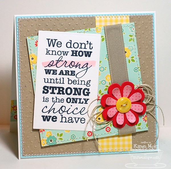
Be Strong by StamperK
The bright, happy colors in Karen's card make me long for spring. It's not exactly on time in my part of the world. But this card was meant to be encouraging and Karen really achieved that with this design and color combination. She layered embossed kraft cardstock over a light blue background, added cheerful shades of yellow and bright red with patterned paper, ribbon, flowers and buttons, and added a stamped sentiment. It's a gorgeous card and sure to bring a smile to the recipient's face.
gh3
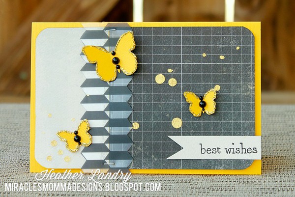
Best Wishes by miracles_momma
Heather's gold butterfly card has achieved the same effect but with a different color combination. Heather used a bright golden-yellow cardstock as the base for her card and layered black-and-white papers over the top. The neutrals contrast beautifully and make the yellow pop even more but then she added beautiful golden butterflies to the top of the card. It's a gorgeous color combination and bright and cheery to boot.
gh4
And there you have them - our gallery highlights! I love all of these and I really do wish we had time and space to feature more of the amazing designs out there. Thanks so much to all of the designers who shared their work with us this week. What were your favorite gallery layouts last week? Feel free to link us to them in the comments and let us know what you think and which are your current favorites in the galleries!
-Stephanie Vetne