
Pinterest Inspiration | Neutral Fabric Collection
When I'm not scrapbooking, you can usually find me quilting or at least thinking about quilting. And I love looking through fabric swatches on Pinterest for inspiration. I fell in love with this fabric earlier this week and then also realized that the neutrals would work beautifully on a scrapbook layout as well.

fqs fabric
This Aster Fat Quarter Pack by Williamsburg can be found at the Fat Quarter Shop and features gorgeous patterns of flowers and leaves in a neutral collection of colors including gold, black, grey and cream.
pockets
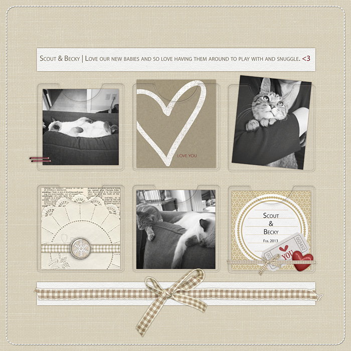
All Supplies from Designer Digitals | Cardstock: Thanksful Hearts Mini Kit (tan cardstock) and Call the Doctor! Kit (cream cardstock)by Pattie Knox. Vellum Pockets: Negative Sleeves No. 04 Plastic Pockets by Katie Pertiet. Embellishments: Parade Days Kit (gingham ribbons) by Lynn Grieveson. Looking for Love Element Pack (love ticket) and Color My Love Element Pack (red heart epoxy) by Katie Pertiet. Vinter Kit (red staples) by Lynn Grieveson. Clean Stitched Borders: White No. 01 (white stitching) by Katie Pertiet. Pocket Cards: Hello My Heart 3x4 Cards (heart card) by Ali Edwards. Frosted Winter Journalers (doily card) by Katie Pertiet. Stina Journalers (circle card) by Maplebrook Studios.
There were so many things that inspired me about the fabric photo - the patterns, the individual colors, the grid layout of photo, the graduated color palette of the layout design, and the rounded corners with clean white borders. I could have used any or all of those ideas as the basis for my layout but I decided to work with the grid pattern and the neutral color palette.
I started this layout with a lightly textured piece of tan cardstock and decided to add vellum pockets to hold smaller cards and photos - mimicking the grid pattern of the inspiration photo. I used all black-and-white photos to maintain the neutral color theme and chose kraft-based pocket cards. One of the pocket cards has red text on it and, along with the pink label on the fabric photo, it inspired me to add just a pop of red to my layout. I added in a couple of small embellishments to the bottom right pocket to mimic the placement of store's pink label and then added red staples to the top left photo and a tiny red heart at the end of my journaling. The placement of the small red accents creates balance and forms a design triangle that helps the eye move through the layout. I finished it off by adding some strips of cream cardstock to the top and bottom to add little more light to the page and added my journaling to the top strip of cardstock.
I love spending time on Pinterest and I always find something to inspire me. I hope that you are inspired by this design as I was. Let me know where you find inspiration and maybe I’ll use it in a future column. You can also follow my Pinterest boards here.
-Stephanie Vetne