
Gallery Highlights | 2.11.2013
Welcome to another edition of gallery highlights! This edition's layouts are all about using color and pattern to tell a story. I'm in love with all of these designs and I can't wait for you to see them. Let’s go take a look and I hope you like them all as much as I do. Don’t forget – you can click on the links to visit the layouts in their galleries and view supply lists, leave a comment for the designer, or view the designer’s other work.
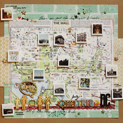
Epic Family Trip to DC by adventurousBran
Brandy used a map as the background for the pictures of her family's trip. She layered tiny pictures over the map showing highlights of their visit and used dimensional adhesive so that they literally popped off the map. She also stamped and misted the background, added in adorable shapes and cut-outs as well as little bits of journaling. This is such a great idea - I can't wait to try this for my family's next trip.
gh1
Swim Lessons by kellymb
Kelly used a neutral grid paper for her background and stacked three photos along one side of the layout. She chose brightly-striped paper strips to border the photos and then added small embellishments in the same color families as the paper strips. Using the same colors in small embellishment clusters in various spots on her layout balances the layout beautifully.

gh2
All Dad's Idea by Amy L
There are at least 11 different patterns and textures in Amy's layout, and she combined them perfectly. Her primary background paper is a slightly muted pattern, and then she used smaller strips of brighter patterns to ground her photo on the right side. To allow her photo to pop and not get lost in the color and pattern, she framed it with a thin white frame and then double-matted it on another light piece of paper. It's a fantastic way to highlight such a great photo!

gh4
My Silly Girl by neeceebee
I love the patterns and colors in this next layout! The designer layered white cardstock over two different pieces of black-and-white paper. She then layered three small photos over bright colors and textures, bringing in more black-and-white papers for consistency and those adorable photos just pop off the page.

gh5
Christening Corinna by jesshunt
Jess uses texture and color perfectly in this beautiful layout about her niece. She used a neutral background but added a textured border to it and subtly layered lightly-colored blue embroidery patterns around her photos. She added an embellishment cluster to the middle of the layout but kept the colors neutral so as not to distract from the photos. It's an excellent use of color and texture!

gh3
This Moment by Leanne Allinson
Leanne's design highlights a wonderful way to use white cardstock. Using the white as her background, she layered black-and-white photos over brightly-colored paper and embellishments in the middle of her page. To add balance, she also added in papers and embellishment clusters to the top and bottom of the page. White cardstock has never been brighter!

gh6
And there you have them - our gallery highlights! I love all of these and I really do wish we had time and space to feature more of the amazing designs out there. Thanks so much to all of the designers who shared their work with us this week. What were your favorite gallery layouts last week? Feel free to link us to them in the comments and let us know what you think and which are your current favorites in the galleries!
-Stephanie Vetne