Trendwatch: Fill Text
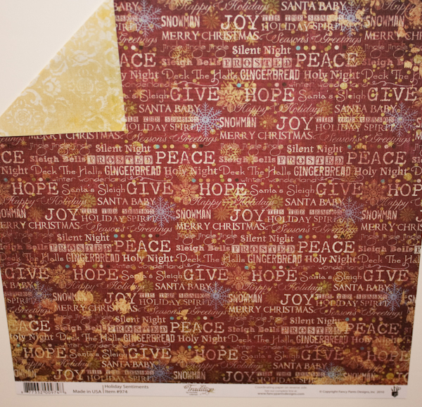
The use of text in design has been a trend in scrapbooking for quite awhile. But the trend has morphed over the past few years, and it's latest incarnation was extremely apparent at CHA Summer 2010.We started a few years ago with the simplest version of the trend, with text embellishments being hot. Words themselves were used as our decorative elements on a layout.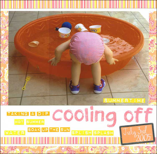 Supply List:Patterned Paper - Making MemoriesPhrase Stickers - EK SuccessStamps - Technique Tuesday (Lemonade Stand large)Ink - UnknownTag - Making Memories TagmakerCardstock - BazzillRub-ons - Heidi SwappSince then, we've moved into the use of text as a fill pattern in product design. Embellishments and papers now use text in various styles and sizes as an all-over fill pattern. While this has been a growing trend at the past few shows, it absolutely exploded in the lines shown at CHA Summer 2010 in Chicago.There are several distinct styles of text-as-fill that were on display on the show floor.The first style has been around the longest. I'll call it collage-text-as-fill. These designs are typically made up of words (often themed) in different sizes and fonts made into a collage background. Several companies that specialize in themed items, such as Karen Foster and BoBunny, have created designs such as these for years. What's notable now though is the wide variety of companies that are offering these sort of text designs, even companies that don't typically offer a lot of themed items.Fancy Pants Design offered up a classic example of this collage-text-as-fill in its CHA Summer 2010 holiday line introduction, Traditions, with a paper called "Holiday Sentiments":
Another excellent example of the collage text style comes from Little Yellow Bicycle's new kitchen-themed Savor collection:
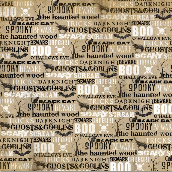
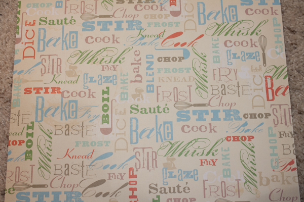 In both these examples, you'll note that there is more than text in the design. There are also graphic elements in the collage that are related to the theme. My Mind's Eye did that to particularly dramatic effect in their new Halloween collection, Haunted:
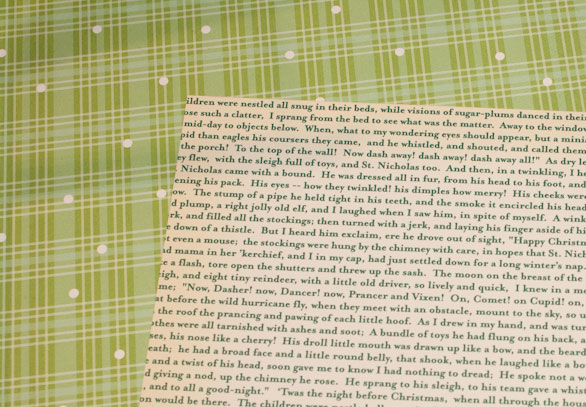
The vintage style that is currently trendy lends itself especially well to the use of text-as-fill. At previous shows, we'd seen many papers utilizing antique newsprint pages and emphemera collages. Now we are seeing text fill that looks like the pages out of a book, set in antique printer or typewriter style fonts.
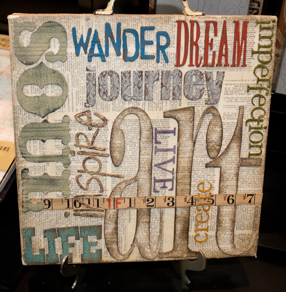
Tim Holtz's Idea-ology line takes the concept very literally (and displayed it using text collage styled samples, combining two styles of the trend):
 The new My Minds Eye Lost and Found collection has a very literal take on this style as well, although with narrow columns of text this particular paper is more newspaper styled than book leaf:
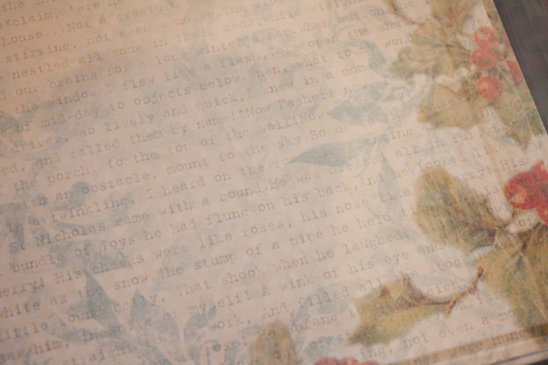
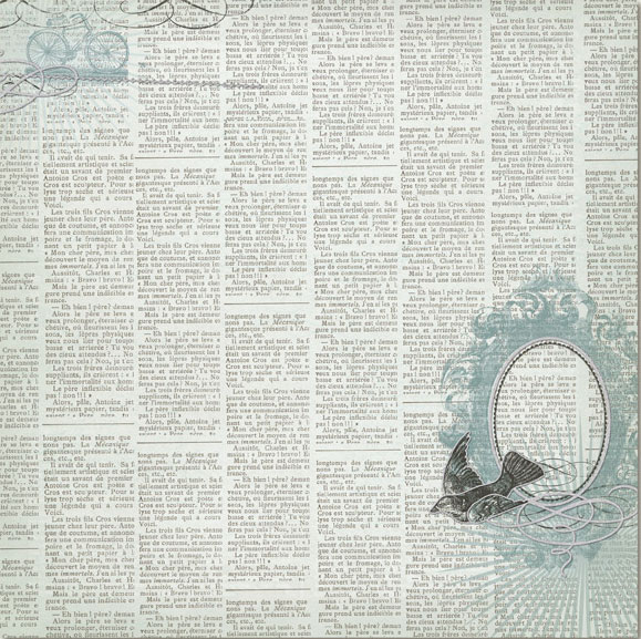 As the My Minds Eye paper above shows, sometimes text fill can be seen used as a layer with other design elements. Melissa Frances used this concept beautifully in one of their new holiday papers that they showed at CHA Summer 2010. The typewriter style text is used slightly faded out so that it becomes almost a texture in the background and not a focal point in the design:
 Another way of stylizing vintage text is by changing the color scheme on it from traditional type colors. Several companies did this, especially with Christmas-themed text. A typical example is a paper from October Afternoon's upcoming holiday line:
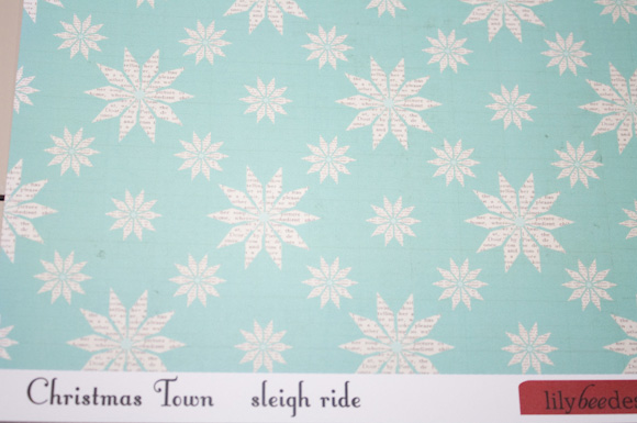
Fill text wasn't only being used at CHA Summer for entire backgrounds. It was also being used to fill just specific design elements in a background, such as a single stripe in a graphic design, or as fill for a single graphic element in a design. Lily Bee Designs did that by creating snowflakes filled with tiny text on one of their holiday papers.
Besides using typewriter or typeset style fonts, another way of making fill text look vintage is to use script fonts to create it. Many companies are using this style to create vintage fill text.
House of 3's collection for Pink Paislee, called Parisian Anthology, made extensive use of script text as a fill element in its design:
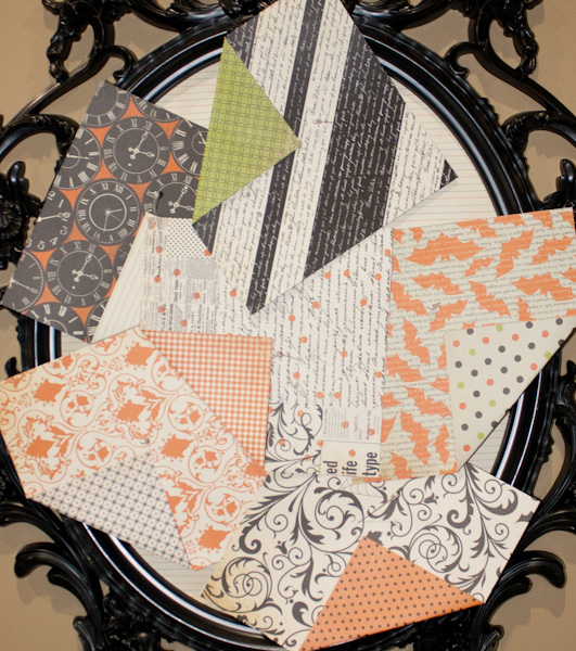
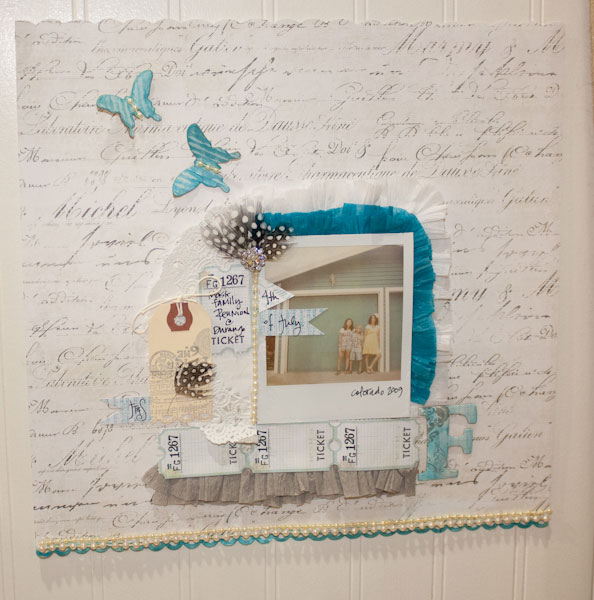 Margie Romney-Aslett also made use of a lot of vintage script text in what might be a slightly unexpected place - her Girls Paperie line for Halloween called "Toil & Trouble":
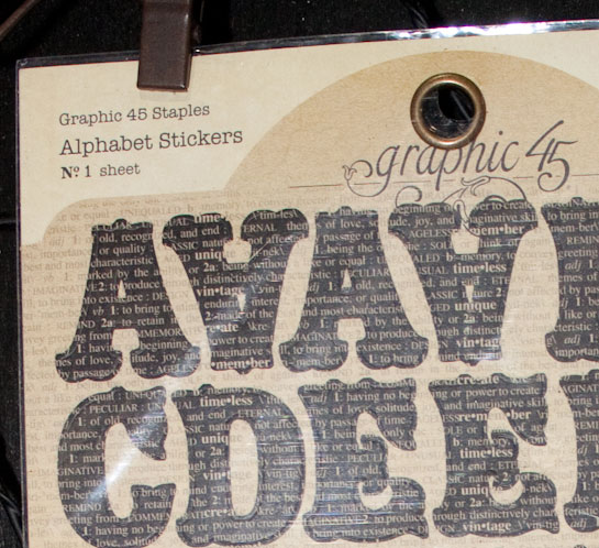
 It's not just background papers that are using text as fill, either. Embellishments are getting in the trend of using text as fill as well. Graphic 45 had alphabets in their new line of embellishments (a first for them) called "Staples" that were filled with tiny vintage text:
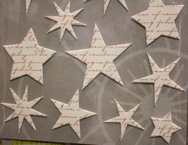
 Jillibean Soup had a great example on display of using script text as fill in embellishments with their Canvas Stars addition to their canvas embellishment line:
 Text fill is showing up in digital scrapbooking as well as paper scrapbooking, so it has become fairly universal. This trend is so widespread and so tied to the vintage trend that I would expect it to be around for awhile - at least as long as we continue to see vintage as a force in the market.
